Dec 15, 2010

Final Project


Thumbs

Rough

Transparency for screen exposer
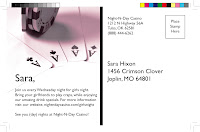
Canvas screen print

Screen print on taupe canvas, not such a fan. Harder to read the details on it.

I was so extremely excited about the leather, and although the color looks good on the leather the print did not turn out well because of the fact that the leather is not totally flat.

You can see above that not all the details came out because of the texture.


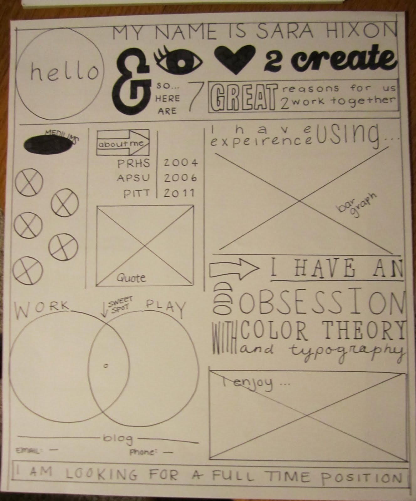
When this final project was assigned, my mind was going a million miles a minute. I have been wanting to do an alternative resume to give to interviewers; because I love to design, I feel as though a designer should have a resume that stands out, and my mind wondered about what that could be. I finally decided to to a 11x13 poster sized typography and vector filled resume that would give 7 great reasons to work together. We were assigned to "WOW" our professor so I wanted to take my fine arts element and screen print it onto fabric. Then I decided I would use canvas, and attempt a piece of leather. My target audience is any and all interviewers, as well as other designers. Call to action would be the contact information listed on the poster. When getting a price quote for the project, I talked with the screen print professor (who helped me finalize my poster) said that on average the screen cost about $15 and prints are about $1.25 per, and they only do 24 or 36 in bulk.

Nov 29, 2010

Magazine Ad


Full page thumbnails

Half page thumbnails

Full page ad rough

Half page ad

Full Page proof

Half page proof

For this assignment we were required to research magazine ad specs and design one of our own. During my research online I noticed this company called "crumbs cupcakes" I felt that their ad could use some jazzing up so I chose it to re-design. The name of the publication I designed this ad for was "real simple".
My full page ad dimensions are 8.625"x10.875" with a .125" bleed and a .5" margin on all sides. My half page ad's dimensions are 3.375"x9.875" with no bleed and .5" margin. My target audience is essentially all individuals who like to eat sweets, particularly mom's looking for sweets for birthday parties, etc. My call to action was my web address at the base of each ad.


Nov 16, 2010

VARIABLE DATA- also known as Direct Mailing


Male Front
Male Back
Female Front
Female Back

Everyone, (no matter who you are) gets direct mail, or “variable data” sent to them at least once a month or so. Direct mail is defined as “advertising sent directly to prospective customers via the mail”. I don’t know about you, but a lot of the time, when I get direct mail I slightly look it over and then toss it in the trash. Now that I have completed a direct mailing assignment for my digital file preparation class, immediate tossing of the direct mail will no longer be something I do.

We were given the task to complete a direct mailing piece that was 5x8”, and could be directed to at least two separate audiences. My original idea was to target residents and businesses that might be moving, advertising a moving company. I then decided to change my idea to, Night-N-Day Casino. My target audience was male and female, and my call to action was drink specials that advertised for nights that the casino was usually slow.

In my variable data I used elements such as a duotone on both of my male and female projects, as well as on the front and the back. I also utilized the COB (cut out background) lesson and completed that on all of my images as well. Finally, I used a hard drop shadow on my logo design, and a screen tint as well.

I wanted my design to be flashy enough to catch the eye of the recipient, (so to not get immediately tossed in the trash) but also be clean and simple. Something as small as a 5x8” card can fill up fast with cluttered text and images, my goal was to design a more simple and to the point piece of variable data that could appeal to men and women.

Nov 15, 2010

Four State Technology Conference

Pittsburg State University's Technology Center was home to the technology conference this year, and the option to attend informational lectures was a great resource for GIT students. The lecture that I chose to attend was one that talked specifically about photography. As a art student I have a lot of interest in various media of art, so the "photography review, going wild" title of the lecture caught my eye.

Upon arrival at the lecture we were given notepads, a pen, and informational packets. While I looked at the outline for the lecture while waiting for it to begin, I noticed a lot of the information that was planning on being covered was, in fact, a review. Also, while waiting, I noticed the notepad he gave us from his graphics department at his university; I don't know if it was because I had just recently completed a similar assignment in my digital file preparation class, but I noticed a lot about their notepad that I would want to prefect before handing it out to a fellow graphics department.

Once the lecture had begun I realized my suspicion had come true. This gentlemen's lecture started out as a complete and utter review; he discussed proper f/stops, and ISO's as well as the manual and automatic settings on a camera, (all things I would suspect someone attending a photography lecture would know coming in). This discussion went on for about 15-20 minutes of the 50 minute lecture.

After the review the lecture proceeded into a more promising subject, the dark room. I very much enjoyed his prints he had to show us, and how he developed a lot of techniques we use in photoshop (filters) by spending countless hours in the dark room, dodging and burning, resizing, etc. However, he never gave true instruction on how to complete any of these images in a dark room.

Overall, I did feel like the lecture left me wanting more. It started out slow, but once he started discussing some of his published works I was interested in the way he accomplished some of his prints, but he held back. This lecture started out as a mere review, and ended with him simply displaying his works and accomplishments, I feel that I came out knowing as much about photography as I did going in.

Oct 25, 2010

Newspaper Ad


When trying to think of what type of ad wanted to produce, I started thinking about the types of services I would stop and look at in a newspaper. The first thing that came to mind was a dog walking service, which later developed into a dog care service. I have two large breed dogs and would definitely take advantage of an AFFORDABLE dog care service. To house your dog in at a vet in this town depends on the weight of your dog, my dogs are both over 50 lbs which means a lot of money for me to house them while I go away for the weekend. Also sometimes I don’t always have the time to walk both my dogs, and they have so much energy. A walking service would be wonderful, along with a yard pick up service.

Once I realized what it was that I wanted to advertise I started to think about who else would benefit from these services, other then myself. My grandma just had open heard surgery and is unable to walk long distances, someone her age would greatly benefit from some of, if not all of the services provided in my ad. Another example is my cousin just had a baby and the puppies tend to get the short end of the stick, taking them on a walk would help to get some of the their energy out. Also my mom and dad just got a new puppy after our old dog passed away last Christmas. My mom was very against it sense she just started a new job, and my dad is always away on business. Someone who could come walk their puppy during the day and let her out would help my parents to feel less guilty about working all day and sable being pinned up. Finally as mentioned before, affordable services for college students would be beneficial, so a student discount of some kind would be a good idea.

As far as the design, I wanted to keep it simple. Obviously it being a newspaper ad it needs to be black and white, but I do want to include some dog like graphics to catch a reader’s eye when flipping through the paper. The ad will include services such as dog walking, vacation sitting, yard clean up, as well as my contact; email, phone, web site and rates. The ad will include enough information that will entice the dog owner to call or check out my site.

Oct 18, 2010

Brendan Murphy returns to PITT

On friday October 15th Brendan Murphy (A Pittsburg State alumni) made an appearance and lectured to students about the industry, among many other things.

What did I get from the lecture...

Brendan Murphy attended Pittsburg State Universities 25 years ago in 1985 and has sense achieved so much. Murphy came to Pittstate from Dublin, on a track scholarship; now in 2010 he is working for Lippincott and has made a huge impact in the world of design.
Murphy had many good things to say about his experience at Pittsburg State; he mentioned that his most enduring memory was the people and the community. His advice to students now was to “pay attention in school”. He expressed how important all the information you retain in class is, being that, “75% of his work is writing, 10% drawing and the rest is in training others”. His experience in the field has allowed him to reflect on the importance of school and education. Murphy mentioned also the value of typography, which I feel that our classes stress as well.
Throughout his carrier he has designed many things that a lot of people tend to look over, such as an alternative for the handicapped sign, and the new Wal-Mart logo. His creativity has moved him to senior partner with Lippincott’s main firm in New York City.
Brendan Murphy’s company Lippincott was founded in 1943 as an industrial design company, and made packing for companies such as Campbell Soup and Dixie Cups. Sense then they have expanded to capabilities such as, brand analysis, brand strategy, brand management, and brand innovations. Lippincott has provided services to many well known companies such as, Wal-Mart, Delta, Time Warner, and Wells Fargo, just to name a few. Murphy gave the students in attendance advice over logo and product branding, saying that you want your logo design to reflect a product the consumer can believe in.
Murphy’s final words of wisdom were, “pay attention in school, to all different disciplines. Take courses outside of our major, and it doesn’t end when you graduate. Learning is a lifetime job”. It is refreshing not only to see a alumni of the graphics and imaging doing so well, but a student of the same university we attend going on and making a name for himself.

Oct 15, 2010

Movie poster

In my Layout and Design class we were assigned to design an poster using a popular quote from a "classic movie" I chose Sixteen Candles. The idea was to advertise the movie playing on a movie channel such as turner classic movies.


Gluten Free

My dear friend Morgan is gluten intolerant and has become quite the baker in gluten free products. She asked me to develop a logo for her so that she could have labels for her gluten free baked goods. Below is the process of all the ideas and drafts she and I went through to end up on the final logo.

first idea, I added wheat stocks to the letters of the logo to catch the eye of the viewer.

We needed to incorporate Morgan's name into the logo some how...

another idea kind of playing around with the idea of word play.

Final logo. Morgan came up with the "g free" and the idea of having a cupcake floating above the logo. I took her ideas and came up with her final logo.

Halloween Invites

My mom and dad are having a halloween party with all of their friends, and my mom asked me if I would design a invitation for her. I decided to do a postcard style invite, and sense my mom and all of her friends love cosmopolitans I decided to incorporate it into the invite. Here is a view of the front and back.


Sense my parental units are doing a chili cook off I decided that they should have a vote. I made ballot's for their guest to fill out.

Oct 14, 2010

Gap Logo

photo comes from google images

Simple and classic, these are the words that come to mind when looking at the original logo for the Gap. Like the clothes, their logo was a wallflower in the sense that it was not bold, flashy, and didn’t draw attention to itself. Recently the Gap made the decision to drastically change their logo. The choice to change the logo came from a decrease in sales, and gap made the decision to revamp their brand.
The original logo suited the store brand; their preppy logo matched the esthetic of Gap. The change was too drastic for customers and it is my belief that the better choice would have been for gap to gradually transition; either that or change to something that continued to match the look of their brand. If gap wanted to freshen up their logo they could have changed the color of the square, changed the font, or both at the same time.
A week has based and Gap has heard loud and clear that nobody liked the logo change. When the change was made people got on twitter, facebook, and basically any internet blog site and voiced their passionate disgust for this change. Finally gap decided to go back to the original logo, but not without getting a lot of press. Some might wonder if that what their plan all along.
Now that all the drama is over with the logo change Gap has gotten a lot of press good and bad. Sense the switch back, it has been said that this all might have been a call to action, to get people to submit designs and suggestions. Gap was very quick with commentary about the decision to change, and of course wanted to let everyone know that the new styling of the clothing brought on the change.
Whatever the master plan might have been Gap has drawn a lot of attention to themselves. I must admit in the last week I have visited the Gap site for the first time ever, just to see if the logo was on there and also to see what this new clothing was all about. If this was Gaps goal, then they definitely succeeded.

Note Pad


In my digital file prep class we were assigned to design a notepad as a recruitment tool for possible incoming students.

Above is a brainstorming technique. This identity map helped to think of ideas that might draw in possible future students. Things that high school students might be interested in.

10 thumbnails gave me many options to choose from.


I finally ended up on a notepad that was inspired by facebook.

Final notepad

Throughout the process of brainstorming for this notepad I came up with the idea of drawing the recruits in by associating our department with Facebook. Anytime you go to someone’s facebook page that you are not already friends with then you can add them as a friend by clicking the “add as friend” button. I know college students are on facebook all the time, and now that they opened it up to highschool students they are getting addicted as well. My hope is that the facebook themed design will draw in the recruit, and from there they will connect the irony and hopefully remember GIT (graphics and imaging technologies) when getting on the Internet the next time.
The design incorporates certain elements and principles of design, such as line, balance, and harmony. The use of crisp clean lines helps to makes the designs overall look sharp; this is due to the use of the same thickness of line throughout all elements of the notepad; text, and graphics. The fact that the assignment is a note pad leaves an obvious use of negative space, but because of the header and footer and the juxtaposition of the heavier pieces (the KTC and the check mark) it allows for the notepads design to balance out and not become too crowded.
Finally, a principle of design demonstrated in my design is harmony. The use of line with the balance of the overall design creates a harmony throughout the notepad. The viewer’s eye is drawn in by the facebook reference then picks up on the KTC header, and finally sees that they can visit us on facebook, or at our site, giving them plenty of options.

Feb 26, 2010

Senior Pictures


I was asked by my boyfriends mom if I would take her youngest son's senior pictures. I obviously gladly accepted, and below are just a few of the MANY pictures I took.