My buddy Karl was kind enough to be a model for my portrait photography assignment. Dont let his tatoos fool you, he wouldn't hurt a fly.


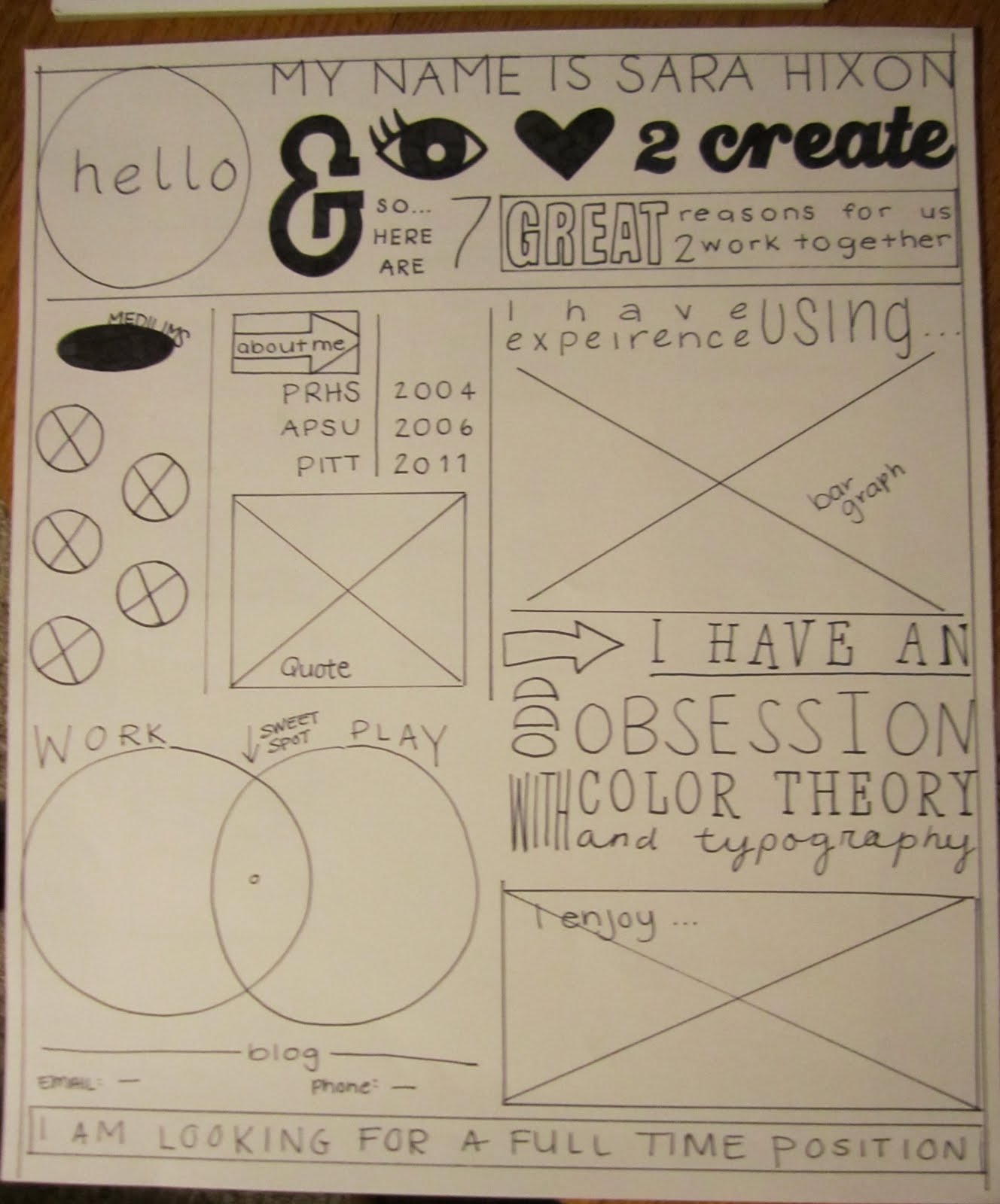


Everyone, (no matter who you are) gets direct mail, or “variable data” sent to them at least once a month or so. Direct mail is defined as “advertising sent directly to prospective customers via the mail”. I don’t know about you, but a lot of the time, when I get direct mail I slightly look it over and then toss it in the trash. Now that I have completed a direct mailing assignment for my digital file preparation class, immediate tossing of the direct mail will no longer be something I do.
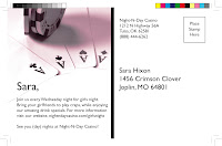
We were given the task to complete a direct mailing piece that was 5x8”, and could be directed to at least two separate audiences. My original idea was to target residents and businesses that might be moving, advertising a moving company. I then decided to change my idea to, Night-N-Day Casino. My target audience was male and female, and my call to action was drink specials that advertised for nights that the casino was usually slow.
In my variable data I used elements such as a duotone on both of my male and female projects, as well as on the front and the back. I also utilized the COB (cut out background) lesson and completed that on all of my images as well. Finally, I used a hard drop shadow on my logo design, and a screen tint as well.
I wanted my design to be flashy enough to catch the eye of the recipient, (so to not get immediately tossed in the trash) but also be clean and simple. Something as small as a 5x8” card can fill up fast with cluttered text and images, my goal was to design a more simple and to the point piece of variable data that could appeal to men and women.
Pittsburg State University's Technology Center was home to the technology conference this year, and the option to attend informational lectures was a great resource for GIT students. The lecture that I chose to attend was one that talked specifically about photography. As a art student I have a lot of interest in various media of art, so the "photography review, going wild" title of the lecture caught my eye.
Upon arrival at the lecture we were given notepads, a pen, and informational packets. While I looked at the outline for the lecture while waiting for it to begin, I noticed a lot of the information that was planning on being covered was, in fact, a review. Also, while waiting, I noticed the notepad he gave us from his graphics department at his university; I don't know if it was because I had just recently completed a similar assignment in my digital file preparation class, but I noticed a lot about their notepad that I would want to prefect before handing it out to a fellow graphics department.
Once the lecture had begun I realized my suspicion had come true. This gentlemen's lecture started out as a complete and utter review; he discussed proper f/stops, and ISO's as well as the manual and automatic settings on a camera, (all things I would suspect someone attending a photography lecture would know coming in). This discussion went on for about 15-20 minutes of the 50 minute lecture.
After the review the lecture proceeded into a more promising subject, the dark room. I very much enjoyed his prints he had to show us, and how he developed a lot of techniques we use in photoshop (filters) by spending countless hours in the dark room, dodging and burning, resizing, etc. However, he never gave true instruction on how to complete any of these images in a dark room.
Overall, I did feel like the lecture left me wanting more. It started out slow, but once he started discussing some of his published works I was interested in the way he accomplished some of his prints, but he held back. This lecture started out as a mere review, and ended with him simply displaying his works and accomplishments, I feel that I came out knowing as much about photography as I did going in.
